Showing posts with label LAUIL503. Show all posts
Showing posts with label LAUIL503. Show all posts
Wednesday, 17 January 2018
Tuesday, 16 January 2018
Monday, 15 January 2018
Reflective Report - Moving Images
For my animation, I had every intention of pushing myself and getting my figures from my print to actually walk along the screen. I knew this was going to be a challenge but if it worked, I knew it would be very effective.
What went well?
Scanning my drawings of the walking cycle into photoshop and editing them allowed me to select the images as a series and upload them into After effects
Getting my figures to walk! Although probably not the smoothest walk cycle, I was still happy that I managed to achieve it.
I used various textures for the figures to give off that old fuzzy TV effect and to convey they idea that they are moving by turning up the blur effect.
Each figure has a slightly different texture because i wanted to play around with depth - something which i think works quite well.
I think the figures slowly disappearing one by one is a good touch as it adds to the power and dominance of the blue figures as the black figures are slowly being engulfed by the human race.
Struggles?
I wasn't sure whether to have the black figures walking in the opposite direction or to just stand still. I tried with them walking but i felt like there was too much going on.
I had the figures standing in front of the blue figures which looked a little basic and the depth that i thought i had created with the textures, looked to have disintegrated. I allowed some of the blue figures to walk in front of the black figures which added to the depth and intensified the dominance of the blue figures.
The sound
I wanted just some simple 'walking sounds' - i experimented with listening to people walking in public with background sounds but i noticed that there was too much going on and it actually distracted me from the sound which was most important - the walking.
I wanted to combine two different walks, as the figures aren't walking in unison so there are some cross overs. This creates an uneasy atmosphere as there are is no real clear structured walking formation. It was relatively difficult to find a walking sound which actually corresponded with the walking visual simultaneously.
Tuesday, 2 January 2018


Thursday, 7 December 2017
Study Task 6: Presentation
 Dan Forster
Markets his work on 'Etsy'
The piece of work is framed in the photo but comes unframed.
States the size of print and type of paper stock (270gsm)
4 colour screen print
125 editions
Big apple prints
Etsy user
Painter, scans his paintings in and prints them onto canvas's, posters or glossy prints.
Reproduces a lot of prints
Presented against a wall - show customers what it looks like in context.

Monday, 4 December 2017
Moving Images proposal
What do I intend to produce?
My initial idea was to produce a simple animation of figures walking from left to right along the screen and then walking off the screen with 'Toni Morrison' popping up.
If this doesn't work (I heard making figures walk is actually quite difficult) I was thinking of having a figure praying and then blue eyes gradually start appearing until the whole page is blue and the 'Toni Morrison popping up.
Themes/concepts?
I want to use one of my prints which outline both my author's work and her beliefs. Based on her quotes and texts from her books.
Moods/ideas?
I want my animation to reflect more of an old retro feel - If i could add an effect to make it like this than I will. A lot of the stuff Toni Morrison writes about is from years and years ago so I think this effect will fit the animation quite nicely.
Audience?
My animation will be aimed at more of the older generation or people who understand what actually happened or people that can relate to the experiences. It could also appeal to the younger generation who don't know much about black history or slavery - potentially educate them.
Friday, 1 December 2017
Reflective report - printed pictures
What have I been doing?
I have established that lino print isn't successful enough to be considered for a final print. My designs are very simple and I feel like lino is for more complex designs with more line work.
Screen print is also something I have drifted away from, purely because of the crisp, precise compositions in the outcomes - something I don't want reflected in my outcomes.
Mono print not only conveys that gritty, dirty texture, but there is something really interesting about the unplanned and unpredictable nature of the outcome. Through experimenting, I have discovered some really interesting 'mistakes' which have contributed to the success of the composition.
I have been spending a lot of time in the print room, experimenting, playing and testing.
What is working?
My colour palette of black and blue - very striking and the blue reflects the poignant emotion.
The simple imagery opens up various interpretations for the viewer - allowing them to relate in some way or another.
The texture the mono printing press is giving to the design adds that extra edge and gives it a greater level of sentiment.
The texture of my paper also adds to this effect.
My designs cohesively work well as a series.
My concepts reflect my author's beliefs and themes from the books in more of a subtle way
What needs improving?
The paper I am using for my stencils is far too thick, therefore the ink is struggling to get through the smaller cut outs.
The printing press's pressure is too much and actually creasing my prints.
My stencils (A3) are perhaps too large and I need to reduce the size to A4.
Some of my prints are a little too messy and perhaps need to scan them in and clean them up a bit on Photoshop.
One to One tutorial feedback:
One of my designs (the space ship one) I have a 'space ship' with intentions of morphing it into a blue eye. My tutor told me it doesn't look anything like an eye so this was something I needed to adjust.
For my 5th design I was struggling to come up with something. My tutor suggested that my theme seems to be repetitions of themes, for example the eye, the people, the hands - so why don't I choose something else to repeat.
Ideas:
A mouth engulfing a figure (Sethe from Beloved) with hands coming out from the teeth.
Blue eye at the back of the mouth
Repetition of hands grabbing a figure
What am I going to do? Actions?
Design my 5th design and re do all my stencils but in A4 print so my prints don't crease.
Saturday, 25 November 2017
Study Task 5 - Sound study
Animation 1:
https://vimeo.com/47547114
'Two Finger Typist'
The sound corresponds well with the animation by changing colour. When the sound gets faster so does the change in colour. It gets faster and faster until the coffee spills on the laptop - this relates to the kind of thing I am thinking of doing in terms of people walking and then the speed gradually building up alongside the sound. The sound getting faster and faster until the black figures walk along the screen when there is no sound anymore?
Animation 2:
https://vimeo.com/4020697
The sound in this animation is really interesting. It's harsh and the colours give it more of a fuzzy, fragmented representation. I like this idea in relation to mine - with the figures walking, each step they give off a fuzzy (noisy) effect with the sound. I quite like the fuzzy texture anyway because it gives off that old retro feeling (my author writes a lot about black history so it works quite nicely).
Thursday, 9 November 2017
Study Task 4 - Animated shorts/stings
Animation 1:
https://vimeo.com/117803815
'Shapes'
The simplicity and cohesive narrative - each shape blending into another - strong relationship and smooth transitions. Variations of pace.
Animation 2:
https://vimeo.com/79823240
'Asu'
Complex - numerous transitions - Text mixed up with the characters - focusing on the walking cycle which is something I am hoping to try and achieve. Very fast paced. Effective cohesive narrative.
Animation 3:
https://vimeo.com/47115080
'The Unconscious Homeless man'
Very simple but so effective - subtle transitions but a clear narrative with some added humour. Successful and elegant aesthetic - is this something I want to focus on? - making very simple movement with well illustrated pieces of work? Very slow paced which keeps you locked in.
Sunday, 29 October 2017
Further ideas
I like the idea of morphing the famous 'blue eye' into a spaceship somehow, capturing all the black bodies. This whole concept is extremely provocative but I wanted to show the black people's urge to feel accepted and 'normal'. But it also shows aspects of being captured for slavery - this idea was mixing both aspects of 'The bluest eye' and the slave trade.
I wanted to really simplify the black figure down to convey that message of not feeling human and not being treated as humans.
Wednesday, 25 October 2017
Initial designing
I wanted to look back over some of my original sketches for my editorial work to give me some further inspiration.
One of Morrison's quotes which really stuck in my head was 'Trespassers among the human race' (when she was talking about how black people felt in the time.)
I liked the idea of a busy crowd of people walking in one direction to represent the 'human race' and then a few small black 'figures' walking in the opposite direction to emphasise the separation and isolation.
The contrast in the tall and small figures works so well as it really captures that idea of power and segregation.
The repetition of figures emphasises the busy composition and adds well to the intimidation the black figures are experiencing.
The black figures aren't the cleanest and sharpest pieces of work to represent that idea of feeling incomplete and not included.
Group Crit
Main feedback points:
Don't be afraid to be more provocative with your designs.
Continue printing and experiment with some more designs.
Try some mono prints with your stencils to add some texture.
The simplicity works so well with such a complex concept.
Friday, 20 October 2017
Printed Pictures Proposal
I intend to produce:
5 striking prints focusing on simple imagery.
The content will focus on:
The social and cultural background of not only Toni Morrison, but the books she has written. I want to find out the deeper meaning of the books and the messages conveyed - the relevance they both have on today's society.
I will be aiming to communicate:
Levels of power, sense of segregation, blue eyes contrasted with the black. I want the bits of blue to really stand out. Quite shocking imagery but I also want this to be presented in quite a subtle way - allowing people to really analyse the image and question bits.
To an audience of:
I want my work to appeal to the younger generation to make them slightly more aware of the context - I do feel however because of the context, it would appeal to more to the older generation as they would be able to understand it more, and of course if the imagery is quite striking and provocative it would appeal to someone with a thicker skin perhaps.
Saturday, 14 October 2017
Study Task 3 - Print process illustrators

Rick Berkelman (Hedof)
Uses screen printing. Scans everyday objects like bread, water etc. Also does some street art. Works in his studio for commercial art. Exhibiting his work made him famous on an international level.

Shepard Fairey
Screen printing and hand-made stencils. He does a lot of street art. Limited colour palette (red black and gold) Makes a few 4 layered stencils.

Iain McIntosh
Uses both traditional and digital techniques. Creates logos and line illustrations. Wood and Lino. Doesn't just stick to one type of illustration but likes to create numerous different type of illustrations (editorial, book jacket designs)
Reflective Report - Editorial illustrations
Thoughts?
The cut out designs work really well as compositions - the simple designs create more of an abstract complexity when you look closely at what is being portrayed. I think negative space is something I want to really use to my advantage in my editorials, as this is a tool which could really work with my concept. I need to start thinking about format and how my designs will fit into each of the dimensions. Do I want to start adding texture? Perhaps introduce a different colour?
Texture?
Adding some texture to my designs gave them a whole new dimension. It emphasised the struggle for power with the black texture juxtaposed by the pure solid white (representing the more polished and 'desired' aesthetic). It adds real sense of depth and I think the scratchy technique works so well with my concept.
Texture doubts?
I think because the black has become more textural, it has lost that sense of opaqueness and therefore the contrast between the white and black is less striking. The pure black and pure white combination emphasised the intense, dramatic atmosphere which was being portrayed. The white doesn't stand out as much which is something I wanted to really portray.
Solutions?
After scanning my textural cut out experiments into Photoshop, it became evident that the print out versions were not as effective as I hoped. I felt like the image was lost amongst all the texture in the background and the simplicity (which I initially wanted to focus on) wasn't clear anymore and the overall composition depicted more of a complex structure.
I decided to go back to my original idea of pure black and white with the edges shaped and perfected.
Final Images
I completely stand by my decision to not add any texture. I think my images are extremely striking, dark and intense which is what I really wanted to convey and feel like it reflects Toni Morrison's writing very well. My motif for these illustrations is the eye. The subtle use of blue which pops out works really effectively and makes people question what is going on. The simple images and my bold use of negative space add real intrigue and you can clearly tell there is a deeper meaning. I wanted to emphasise the bold contrast between black and white and show a sense of power, something I wasn't able to achieve using texture.
improvements?
Perhaps I could of experimented with using different colours other than black and white. I know that my concept is all about the difference between black and white and how she 'longed to have blue eyes' but I could have taken it to a whole new dimension and played around with colours - what colours represent lower class and higher class? In my group crit someone said that she didn't really understand what was happening in my third image - 'what is it looking at'? Maybe I could've made it more clear somehow.
Friday, 13 October 2017
Thumbnail sketching

I focussed on creating really quick sketches based on both books I have been reading. After having a group crit, the main feedback I got was to focus more on the portrait designs as they seem to be most striking with the black and white design kind of morphing two faces together. The clear direction i got was to keep it simple and not be afraid of emphasising the very minimal composition.
What will I do next?
I will start by playing around with the idea of connecting two faces together, nicely blended and morphed into one design. I could perhaps start playing around with cut out paper, my main focus being on simplification.
Monday, 2 October 2017
Study Task 2: Editorial illustrators

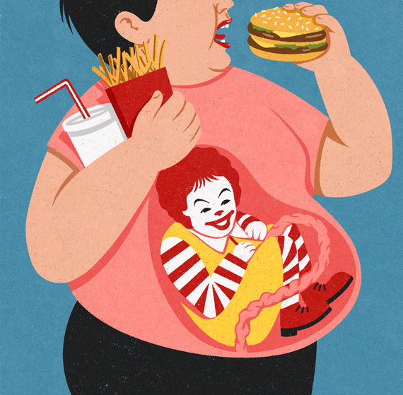
John Holcroft
Holcroft is inspired by 1950s screen print posters and uses this style to create retro style illustrations. His metaphorical illustrations depict what is going wrong with the world today. He focuses on concepts like society's dependence on technology, devaluation of workforce,obesity and politics.


Ben Wiseman
Bright, witty informative contemporary illustrations. Current affairs. He uses digital software to create his illustrations. I really like his simple take on very complex and large scale concepts. A lot of his illustrations depict technology and I think that this is a running theme.
Study Task 1 - About the Author zine
I wanted to combine imagery from both books I have been studying - 'Beloved' and 'The bluest eye'.
Both books convey a real sense of disturbance and dark, sinister auras. I wanted to predominantly focus on high contrast black and white images to create an atmosphere.

Reflection
What went well? I stuck to a strong and clear style which created a cohesive structure - each page looks as though they are meant to be together. The limited colour palette added to this successful effect. I think I have used a strong sense of symbolism throughout leaving people to feel intrigued by what is behind all the imagery and wanting to find out more.
What I could of done better? Perhaps i could have used more daring materials other than ink. If I had more time in perfecting the book I would definitely have used more paint and maybe adopted more of a scratchy technique to emphasise the trauma and pain and the deeper meaning behind the books.
Crit feedback - majority of people loved my use of strong images and symbols to represent my author. They also like the dramatic uses of black and white and thought it worked well alongside the simple shapes. They also mentioned I should use different media.
Thursday, 17 August 2017
Her works
'The Bluest Eye'(1970)
Centred around a young African American girl named Pecola, who grows up during the years following 'The Great Depression'. Because of her skin colour, Pecola gets taunted as the members of her community associate beauty with whiteness. She develops an inferiority complex and desires blue eyes.
Because the book raises controversial issues such as racism, incest and child molestation The book got a relatively bad reception and has been numerous attempts to ban it from libraries and schools.
Morrison's intentions
In an interview, Morrison was asked about her motivations for writing the novel: She wanted to remind readers how 'hurtful racism is' and the fact 'people are so apologetic for the fact that their skin is dark.' Morrison wanted people to try and understand what it was like to be treated that way.
Reception
The book only received a modest amount of attention. Morrison was praised for writing a 'series of painfully accurate impressions' and her wide coverage of emotion in the novel. The most critiqued aspect of her writing is her language in the novel as it was often viewed as being made too simple.
Early critics were also seen as being ambivalent about the portrayal of a black person being an object in society rather than a person.
Themes
Breakage and seperation
Effects of white beauty standards
Media and Culture
Religion
Shame
'Beloved' (1987)
African American slave, Margaret Garner escaped slavery in Kentucky by fleeing to Ohio (free state).
Sethe (the protagonist) a slave who also escapes slavery. After 28 days of freedom, she is found and kills her 2 year old daughter so she is not recaptured and taken back to Sweet Home.
The home in Ohio is haunted by the ghost of Sethe's daughter. Because of the haunting (things thrown around the room) Denver (Sethe's youngest daughter) is shy and friendless.
Paul D - one of the slaves - attempts to make the family forget about the past and forces the spirit out.
'Definitions belonged to the definers not the defined'
'Unless care free, mother love is a killer'
You can't let the past strangle you if you're going to go forward. But nevertheless the past is not going anywhere'
Tresspasserds among the human race. Watch dogs without teeth; steer bulls without horns; gelded workhorses whose neigh and and whining could not be translated in a language responsible humans spoke'
'Love is or it ain't. Thin love ain't love at all'
'In this country American means white. Everybody else has to hibernate'.
Wednesday, 2 August 2017
Toni Morrison
Toni Morrison is the first African-American to win a Nobel prize
She grew up in the American Midwest in a family that possessed an intense love of and appreciation for black culture.
Storytelling, songs and folktales were a deeply formative part of her childhood.
The central themes of Morrison's novels is the black American experience, her characters struggle to find themselves and cultural identity.
Morrison's family were 'intimate with the supernatural'
Storytelling was a huge part of her family when she was growing up - both the children and parents would share stories with one another.
She uses her childhood memories to help her start writing - her real life world is often included in her novels.
Sunday, 30 July 2017
'About the Author'
Initial Research
Toni Morrison:
Novelist, editor, teacher
Won the Pulitzer Prize and American book award in 1988 for Beloved
Awarded Nobel prize
When she was 2, the landlord set fire to the family house because they didn't pay rent. Morrison decided to 'laugh at him', she felt that was the best way to keep your integrity.
The 'Beloved' trilogy
The true story of an enslaved African American woman 'Margaret Garner.' After killing her baby, returns as a ghost to taunt her mother and family.
'Song of Solomon'
'The Bluest Eye' black girl who longed to have blue eyes - girl she met at school, didn't believe in God, praying for 2 years to have blue eyes.
Politics:
Morrison believed Bill Clinton was 'our first black president' with the whole sex scandal. She felt like he was treated like a black person: already guilty.
'I want to see a cop shoot an unarmed white teenager in the back' - justice.
Does not identify her work as 'feminist' doesn't want to take positions that are closed - 'expand articulation rather than close it'.
Michael Gladwell:
Journalist, author, speaker
His mother (psychotherapist) huge role model as a writer
Started at 'the New Yorker' - gained popularity with his articles (tipping point) - became basis for his novels.
Process behind his writing: 'interested in collecting interesting stories and interesting research'.
'Tipping point' - how little things can make a big difference
His works deal with research in the areas of psychology, social psychology and sociology.
William Burroughs:
American writer and artist
Beat generation writer - group of young people who rejected conventional society, valuing free self expression and favouring modern jazz.
Drug abuse
Killed his wife in a prank
Naked lunch - disturbing drug culture journey, slicing up words and phrases to create new sentences.
After drug addiction treatment
Themes: Drugs, homosexuality and death
Margaret Atwood:
Canadian novelist, poet
Feminism - female characters dominated by patriarchy
Dystopia
Speculative fiction not science fiction - could actually happen
Animals - relation with humans
Handmaids Tale complex and disturbing futuristic thriller - All the horrible developments take place in U.S near Boston, while Canada is portrayed as the only hope for escape.
Used to read comic books
Reflection
Toni Morrison is an author who really sticks out for me. There is something really interesting about her writing style and her concepts. Her work is quite dark and deep - I like her point of view and how it is translated through her writing. She is definitely someone who i am extremely intrigued by and want to research more intensely.
Subscribe to:
Posts (Atom)