Tuesday 24 January 2017

Composotion


For this challenge I was given an object, a type of person and a location. I got:

Gun

Fireman

Jungle

I created a few roughs with all three words composed in a variety of different compositions.


I used different sized boxes to give me some idea of size and scale.I experimented with zooming in on certain things within the  frame like the tree and the fireman's face - this creates multiple perspectives and therefore emotions. The bottom right is quite interesting because it creates this idea that the viewer is hiding from the culprit. The silhouette adds to this sinister and dark idea but the fact the viewer is able to see where the figure is, gives them an advantage,

For my final painting I wanted to create a really dark composition. High contrast of dark and light to dramatise the scenario. I like the idea of having simplified objects to represent location - so i could have leaves coming into the frame to symbolise the jungle.


This is my final painted composition. I was very much inspired by Noma Bar in terms of his simple dramatic shapes to create striking images. Ive placed half of the figure in the frame as I feel if I had all the figure in the frame it wouldn't draw the viewer to the gun (the focal point). The negative space adds to this effect and i like how the leaves are almost pointing towards the figure therefore leading your eyes towards the focal point. 

Monday 23 January 2017

Invisibility


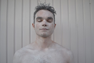
So I decided to paint half my body white. I used both face paint and acrylic as I struggled to maintain the face paints opacity - the acrylic paint made it more opaque. I think this works so effectively and particularly compositionally - allowing the background to play a significant part in the image. In some ways I do like how parts of my body haven't been painted to the extreme levels of pure whiteness - it gives it that sense of realness, however if I were to do it again I would love to go the extreme and completely cover myself in white paint - I think this would create such an interesting composition. What would also of been interesting is if I drew some grey lines on my body to correspond with the background lines, giving it that extra bit of compositional value.


3D and Lens


For this mini project over the Christmas break, I had the power of deciding what superpower I could have and from this decision, create some sort of craft or image which reflects that superpower - in other words become that superpower and take a photo of myself. After careful consideration I was really struggling for ideas, with the thought of having to actually make something at the back of my mind. I did some rough sketching and brainstorming of the type of superpower I wanted to convey. 

My first idea the sun. People have often stated that I am a very positive person so I thought perhaps I could make a sun out of cardboard and and fix it around my head (my head representing the sun) paint my face yellow and wear all yellow clothing. I felt like maybe this idea was a little cringe and not that interesting visually - potentially being seen as something quite humorous.

I have always wanted the power of turning myself invisible whenever I wanted. So working with that as a strating point I did a few sketches and studies.


I created some really interesting studies using wet paint and scratching into it so the base colour comes through. This subtle technique ever so slightly draws out a figure which is barely visible and reflects the whole idea of invisibility so well. I also experimented with different tones on top of each other to create quite eerie and sinister outcomes.

From this idea generation I was thinking I could perhaps dress myself in one colour for example yellow and stand next to a yellow wall - this would create an interesting illusion and a subtle hint of invisibility. Another idea I have which would be more ambitious and create more of an authentic image, is to paint my body the colour and stand next to the same colour wall. 


Sunday 22 January 2017

Evaluation


Overall, I found this module quite challenging. I struggled at the beginning of the untold story project choosing a starting point to build on. I think I have gathered that my strengths lie in more structured briefs, less of the broader, self-development projects.

I learnt new skills such as screen printing (which I really enjoyed) and I now know how to create a book on InDesign. I learnt new approaches to creating imagery through sound recordings and interviewing people to get more of a personal take. I used my blog thoroughly throughout to really reflect on my work, this time focusing more on the analytical side of things rather than the descriptive side, something I needed to improve on from my last module. I experimented with a range of approaches from recording people’s conversations, to interviewing people themselves.

My final screen print for the one week map project worked very well. I think as a team we collectively worked well together and had a structured plan for our outcome. The fact we had an overriding theme worked to our advantage in creating an individual style. I really enjoyed screen printing, something I’d love to experiment with further in the future.

I really like the exploration of ideas with the untold story project. I liked going out of the studio to explore and create work. What is successful about my project is that there is a clear sense of progression and development. I haven’t just focused on one idea, I have continued to explore alternative ways of creating imagery through different areas within my subject. I invested a lot of time in developing an outcome for my book and came across various problems which I have successfully explained on my blog.

If I were to do the project again, perhaps I could have come up with an alternative concept for my book. I’m not quite sure if the idea represents my ambitious mind. Perhaps I could’ve asked a few more people about other subjects not just veganism. This way I could have got more of an interesting story which I could then illustrate – this is more of a personal take and less of a factual story. My problems were mainly my character creating skills – I was unable to create a character which was unique and individual enough. Because of this I decided not to use a character in my final book and thought visually it would be more interesting without.

This module has really taught me to sit back look at my project and what I have done so far and reflect! Think about why and how I got to this stage in the development process and most importantly am I enjoying the work I am producing? Am I just ticking a box? These are questions I aim to ask myself in future modules.

Final Outcome


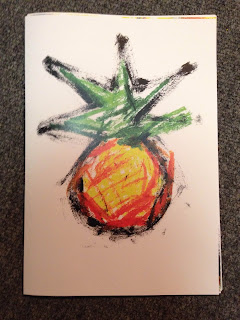
This is my final book. Overall I think it is very successful. I think the compositional layout is extremely effective. The negative space works so well in drawing your eye to the focal point. I really like how you have to really examine the pages to read the text and try and work out what the image is all about. The font is quite striking but because I have used the same colours as the paintings, the text doesn't stand out so much that it over shadows the overall composition. The fact some of the letters are bigger than others, creates a sense of perspective and adds to the explosive style. The expressive style I chose to employ gives it that bit of edge and corresponds well with the rough texture of the pineapple. Perhaps it would look interesting without any text at all? But then again i need some context.

Friday 20 January 2017

Scanning in


I scanned in some of my paintings into Photoshop and experimented with adding text. I think it is much more effective to have online text rather than analogue (cut out bits of collage used as text) because i want there to be clear contrast between the image and the text. All in all I think this is a very effective inside page. The cohesive flow of images from one page to the other works really well and the colours of the texts relate well to the image. I like how some of the letters are bigger than others creating a more interesting composition and making your eyes move around the page, maintaining that sense of excitement. The negative space makes the image less complex and therefore more powerful and significant. So in terms of my book, I want the front cover to have the image of the whole pineapple and then the inside pages to have zoomed in aspects of a pineapple.

Experimenting with text


Here are some experiments with text and image combinations. I definitely think it creates a really interesting, explosive composition and because i have quite a lot of blank white space, the image doesn't appear complex and overcrowded. For my final book I will use the same colours for the text as in the painting so it kind of blends in with the painting and doesn't stand out as much. My target will be making the text legible enough for viewers to actually read it. 


For this idea, I was very much inspired by Lucy Sherston's use of jumbled letters conjoined using collage.


Earlier on in the project I experimented with a title for my book cover, hoping to use a similar style to the rough expressive nature of my pictures. After careful consideration, I feel like I don't actually need a title. I feel like if i were to use a this idea above, it wouldn't work with the other text inside my book - I also think it would draw the attention away from the image on the front of my book. After all this is a picture book and I'm trying to use as minimal text as possible in my book. Because I was thinking of having a painting of a pineapple on the front anyway, I simply don't believe it is necessary to then write pineapple on the front as well.

Marion Deuchars explores text in an interesting fluid way. I like her use of analogue testing, scanning into Photoshop. This relates to my current ideas with text especially in terms of the fluid structure, relating well to the imagery i am currently creating.

Compositional Layout


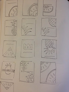
So I started to do some rough sketches to see different ways in which I could compose my drawings on each page. I also created a mock up of my book which had a combination of types of drawings, taking aspects from each. From this I gathered that the most successful was the drawings which had a cohesive flow about them from page to page. So repeating the painting across a double page spread but perhaps flipping the image adding a contrasting perspective. I also found that the paintings which were more zoomed in were more effective as you can't tell exactly what the subject is and the more of the pineapple you can see makes the composition of the page less alluring. Next I will see how I can put text into my work. What kind of font shall I have. In my mock up book I had a simple sentence next to each painting, fairly small simple handwriting, purely because i didn't want the page to be over crowded and too complex for the viewer, taking it away from the beauty of each painting. I however found out that because the text isn't really that interesting, it makes each page come across a little boring? Because there is such a big contrast between the image and the text it doesn't seem to work? Therefore I feel like I need to visually make the text more exciting and include it within the image perhaps? making an explosive composition - this will hopefully make the text more exciting and make the viewer more drawn and want to turn the page.

Pineapple cuttings


There is real sense of movement and energy in these studies and that is something which works to my advantage. The expressive nature and combinations of materials give it a sense of unknown, making the subject appear more intriguing as you are not able to quite work out what it actually is, I could intensify this by zooming in on sections of each study and perhaps in my book, placing them in corners coming out towards the centre with the negative space drawing the viewer towards the image. I dont think i should add features to these studies as I feel they will loose that sense of freedom and perhaps become more refined. I also don't think it would work because if I added say, an eye for example, They would turn into little creature things, drawing away from the fact that they are pineapples.

Friday 13 January 2017

Introducing colour


I combined acrylic paint with oil pastel to create an expressive mixed media composition. The unfinished look works so well. The combination of material creates further textures and the overall feel reflects a pineapple quite well. I could develop this further by perhaps adding some collage to increase the texture further and maybe adding some text to give it some intensity and concept. I should also start to use the same technique for the cuttings.

Texture grounds


I definitely want to include some kind of texture in my book as I feel it creates such an interesting composition. I think the ones without as much paint are more intriguing as it created more of a subtle print - fuzzy and blurry. Future plans - start to add some oil pastels and combine media to create mixed media pieces of art.

Exploration


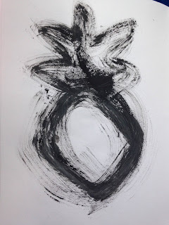
So I used the same technique as in previous examples with the acrylic and brush. This time I focused on the cuttings of the pineapple. There is just something really interesting about these studies. There is real sense of movement and flow and the texture corresponds so nicely with the overall composition. I like how the drawing isn't perfectly drawn, and there is clearly some errors. Maybe start to add some colour? use of a different material? maybe oil pastel or something with great texture. I could also experiment with other techniques like burning paper to create a pineapple shape.

Further developments


I wanted to further my experimentation ability by actually painting the skin of a pineapple and then rolling this onto some paper to create interesting prints. This creates an earthy feeling, quite sharp and rough, reflecting the texture of a pineapple quite well. I could perhaps use this texture on top of future drawings maybe?


I then started playing around with collage and gathering bits of scrap paper together in creating compositions. I think this particular design is very successful as the ripped paper effect and overlaps of different tones of the same colour gives it a rough texture, reflecting the pineapple quite well. Maybe i could add some words or start to introduce some facts in the collage? I do feel like this might get a bit confusing and I want to stick to simplicity.


Artist Laura Benjamin explores sweet wrappers and uses them to create interesting collages. I used this inspiration as another approach to creating imagery. I find it really interesting how the different colours from each packaging creates the tonal structure of the image.

Alternative ideas


So after my tutorial I decided to really reflect on what I was doing and how I actually got to where i am now. I definitely felt like I wasn't exploring enough media and perhaps the media I used in the past was more successful than i thought, I kind of just moved swiftly past it. I decided to do a lot more playful art, messing around with collage, paints, oil pastels etc. I also wanted to show a sense of freedom with my brush strokes, going back to the beauty of line.


Using a brush as a form of expression works purely to my advantage when creating really interesting compositions. I really liked the freedom of not really caring if the drawing turns out 'bad'. The quality of the line work is so effective, It makes you question what the subject really is, but then the unique shape and structure of the fruit gives it away slightly. With the first one, I used pure acrylic paint with a large brush. I think it works so well as some bits of the brush had more paint than others which creates really interesting textures and shapes, with different tonal values present. I feel like it would be quite ambitious and quite a statement to create a book, each page with the same drawing using the same brush and paint - would be interesting to see how different the drawings look from one another. As the pages turn, the drawing will eventually become almost non existent and very subtle outlined. However i don't think this really shows the importance and great health benefits pineapples have - something I want to convey in my book. 


Frank Auerbach is an artist who primarily focusses on expressive brush strokes. Browsing through his work really inspired me to sit back, get all my art supplies out on the desk and just create art without worrying too much about mistakes. His simple brush marks with wet on wet techniques relates well to the work I'm trying to create with my pineapple observational drawings. Also his strong use of texture is something I aim to use in my own work.

Wednesday 11 January 2017

Potential book designs


So these are just some designs I have created for my book. I have created a character by combining crayons with paint to create some sort of texture for the body and simply added white circles as eyes, I wanted to keep it simple to make a stronger impact. I really like how the characters have character, and i think the simple style works really effectively, with the motif of black arms and legs. I think how the character relates to the text works well and the style probably appeals more to the younger generation, however i feel the facts would educate anyone on what pineapples are all about.

I do however feel maybe I'm not pushing myself with materials and processes. Is this idea really that unique and creative? Yes it looks pretty and cute and i'm sure it would look great as a picture book but I think I could still take this pineapple idea in a completely different direction creating a whole new perspective. Does the pineapple really have to look that much like a pineapple? Maybe i could be less elaborative in my approach? Use some collage and combine some materials to create interesting textures and shapes, stepping outside the refined pineapple box. This is something I am willing to explore further.

After my one to one tutorial, I learned that yes perhaps I am playing it a bit safe with this design and as much as I, and people liked it, It definitely isn't showcasing my true ability and i could probably come up with something more interesting. Going back to my previous experiments with pineapples and how ambiguous they were, I should extend this further.

Further testing and developments


So I started to think about ideas for my book cover. My first thought was perhaps each page a different cutting of a pineapple with facts I have researched next to each design. What I was also thinking is having each page having the same outside image of the pineapple but slowly decreasing in content - with each piece cut, gradually the pineapple becoming smaller and smaller. I just feel like maybe these designs could come across quite mundane,and yes visually could look quite interesting as a form of development using the same image, but as an overall book would it really leave the viewer to be amazed and wanting to look through it again? I am not so sure. So this is why I was thinking of perhaps going back yo my character design idea but this time on each page, making the character doing something in relation to the text. For example the fact 'pineapples ripen faster upside down' i could illustrate a pineapple character being tied up by his legs hanging down.

Experimenting


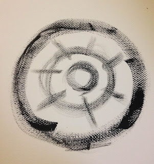
I experimented with various materials and processes focusing on one shape (the inside shape of a pineapple) There is something really interesting about the expressive acrylic painting in the middle. I like how the ambiguity gives it a real sense of interest. Not being able to work out exactly what it is makes the viewer really focus on the image and come up with multiple interpretations. This is then intensified further with my rubbing experiment. The fussy, fading effect makes you really question what is going on and immediately changes the whole mood. Also what is quite interesting is the fact the shape is becoming more and more mechanical looking and man made, when in actual fact the subject is very much natural. Maybe this would be interesting as a picture book? each page with the same image but each with a different interpretation, different material or process used, so more like a visual language take on it, experimenting with line, tone colour and shape. I do feel though if i am doing a book on pineapples, i should have something which has a slight inkling that it is a pineapple. This could be the first drawing perhaps? This is one idea but i should look at alternative ideas.

Cuttings


I started to play around with cutting up a pineapple and drawing the cuttings from multiple angles. I also wanted to see the contrast between the exterior and interior of a pineapple. What I find really interesting is how simple the inside is and how complex the outside is, and the relationship between the two. It would be interesting to experiment with the inside as an image using various materials and processes, repeating the image. I think the subtle colours used give it a real sense of sophistication. Would this look good in a picture book? would it appear to be mundane or dull perhaps? How will i make it more exciting and interesting?