

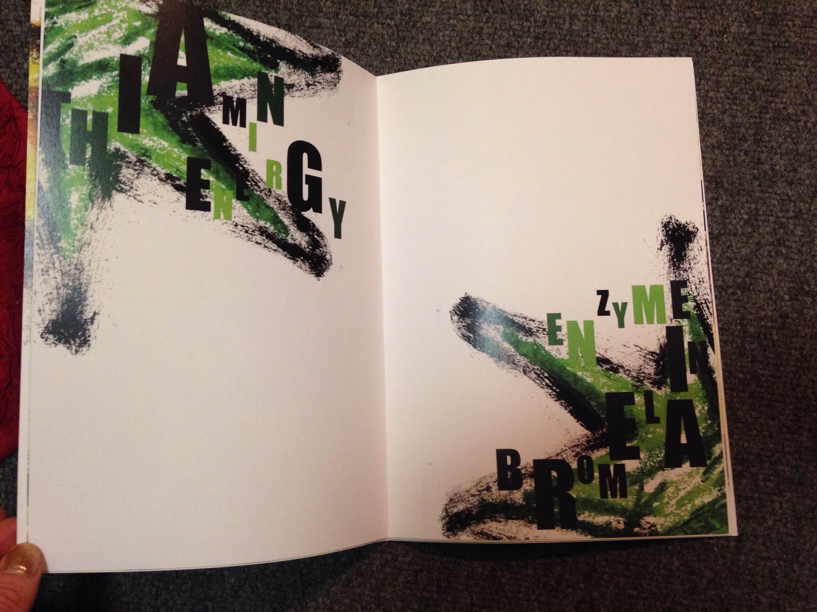
This is my final book. Overall I think it is very successful. I think the compositional layout is extremely effective. The negative space works so well in drawing your eye to the focal point. I really like how you have to really examine the pages to read the text and try and work out what the image is all about. The font is quite striking but because I have used the same colours as the paintings, the text doesn't stand out so much that it over shadows the overall composition. The fact some of the letters are bigger than others, creates a sense of perspective and adds to the explosive style. The expressive style I chose to employ gives it that bit of edge and corresponds well with the rough texture of the pineapple. Perhaps it would look interesting without any text at all? But then again i need some context.
No comments:
Post a Comment