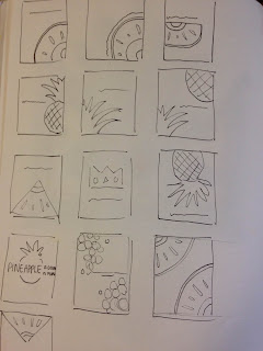
So I started to do some rough sketches to see different ways in which I could compose my drawings on each page. I also created a mock up of my book which had a combination of types of drawings, taking aspects from each. From this I gathered that the most successful was the drawings which had a cohesive flow about them from page to page. So repeating the painting across a double page spread but perhaps flipping the image adding a contrasting perspective. I also found that the paintings which were more zoomed in were more effective as you can't tell exactly what the subject is and the more of the pineapple you can see makes the composition of the page less alluring. Next I will see how I can put text into my work. What kind of font shall I have. In my mock up book I had a simple sentence next to each painting, fairly small simple handwriting, purely because i didn't want the page to be over crowded and too complex for the viewer, taking it away from the beauty of each painting. I however found out that because the text isn't really that interesting, it makes each page come across a little boring? Because there is such a big contrast between the image and the text it doesn't seem to work? Therefore I feel like I need to visually make the text more exciting and include it within the image perhaps? making an explosive composition - this will hopefully make the text more exciting and make the viewer more drawn and want to turn the page.

No comments:
Post a Comment