Monday 27 February 2017

Simplification


Introducing colour:

I decided to dramatise the imagery by adding blocks of black to contrast with the white. My images are starting to come to life particularly with a subtle hint of red.

The top left drawing is inspired by one of my favourite illustrators, Noma Bar. I like how clearly you can identify someone being hugged, but created in such a subtle fluid way that there is simply no need for text. Perhaps i could add some detail? Start to add different colours maybe? I feel like it is quite a striking image and the words that go with it have to correspond well with the image otherwise it just wouldn't work. I could experiment with mono printing focusing on overlapping the image?

Drawing developments


So I decided to pick a few of my favourite designs and simplify them in the circular sticker format.


I've simplified my rouigh sketches into more vector inspired compositions. This brief is definitely for me in terms of reducing images, showing the beauty of simplicity. What I particularly like about the hugging drawing is how much I can simplify it. So much so that the arms could blend into the body creating a Noma Bar inspired drawing. I also really like the idea of symmetry, playing around with the idea of combiniig two drawings and overlapping to perhaps create a third colour? I aim to explore these ideas further by reducing them even more adding some block colour and perhaps inverting them to create varied outcomes.

Initial drawings


I decided to do some initial quick, rough fluid drawings, getting all my ideas visually down on the piece of paper. This fluid rough style of drawing gave me the opportunity to pin point particular successes and then progress these forward.


My initial thought process was coming up with fairly simple concepts but illustrating them in a stylised way. One main idea I had in mind was 'affection'. This is something which personally I feel is needed more in this world, The feeling of having the physical affection is something special and makes you feel supported and safe. It shows someone cares a lot, done through the most simple of approaches. I for one, definitely don't to this as often as I feel i should - even just a small hug can make someones day and lift their spirits completely; knowing that you are there for them. So this is an idea i want to visually play with. I also decided to look outside the box and think about things which give kindness to not someone, but something inside the body.. eating healthily or exercising?
Or using sunglasses to give kindness to your eyes, protecting them from the sunlight. These are all ideas I want to explore further by simplifying them down using simple line drawings. 

Friday 24 February 2017

Screen printing


My Problems - I printed out the positives in black but because the printer isn't very good, the black wasn't at its purest and therefore it didn't come out as opaque as I would have liked when washing off the emulsion. Because of this I used a power hose to get rid of any unwanted marks, which worked successfully. Another issue i had was the paper kept on sticking to the board after i printed, because the vacum was too strong, holding it down. I put another sheet of paper down to compensate. The black appeared to come out more of a grey colour because i didn't put enough black paint down. I like the overlapped effect creating a further colour, particularly with the blue and red creating a purple. I definitely think the red and black as colours are most effective.

Thursday 23 February 2017

Acts of kindness


 Acts of kindness:

Giving the people you love regular hugs

Giving some money to the homeless

Giving kindness to your eyes by wearing sunglasses to protect them from the sun

Exercise, giving kindness to your heart and well being

Complimenting strangers

Eating more ginger

Beautiful surprises

Hold the door open for someone

Smile! It's contagious

Tell the people you love, you love them

Head up, walk tall

Drink water

Pick up litter

Remember to turn lights off

Share a kiss


Study Task 2 - 'An act of kindness'


For this project, I will creating a circular sticker design, encouraging people to perform an act of kindness (80mm diameter). I will be using Adobe Illustrator to create my design and will be using no more than two colours.

Initial thoughts:

To me, this is more of a graphic based project which I'm very much excited about. I'm particularly fond of logo designing so, hopefully this project will allow me to show my skills. I also really like the theme for this brief as I'm always looking for ways in which I can be kind and go out my way to make someone else feel happy. I will first be exploring the different kinds of acts of kindness and illustrating them with as much freedom as possible. I will then simplify these down, using illustrator and vectors.

I had my first Illustration induction the other day and found it much less tricky than i initially expected. I learnt how to trace an image and create curved lines. 

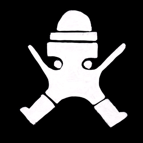
This is the sticker I created on Illustrator, playing around with colour fill and colour stroke. I also learnt how to reflect one side of an image, if the image is symmetrical. 
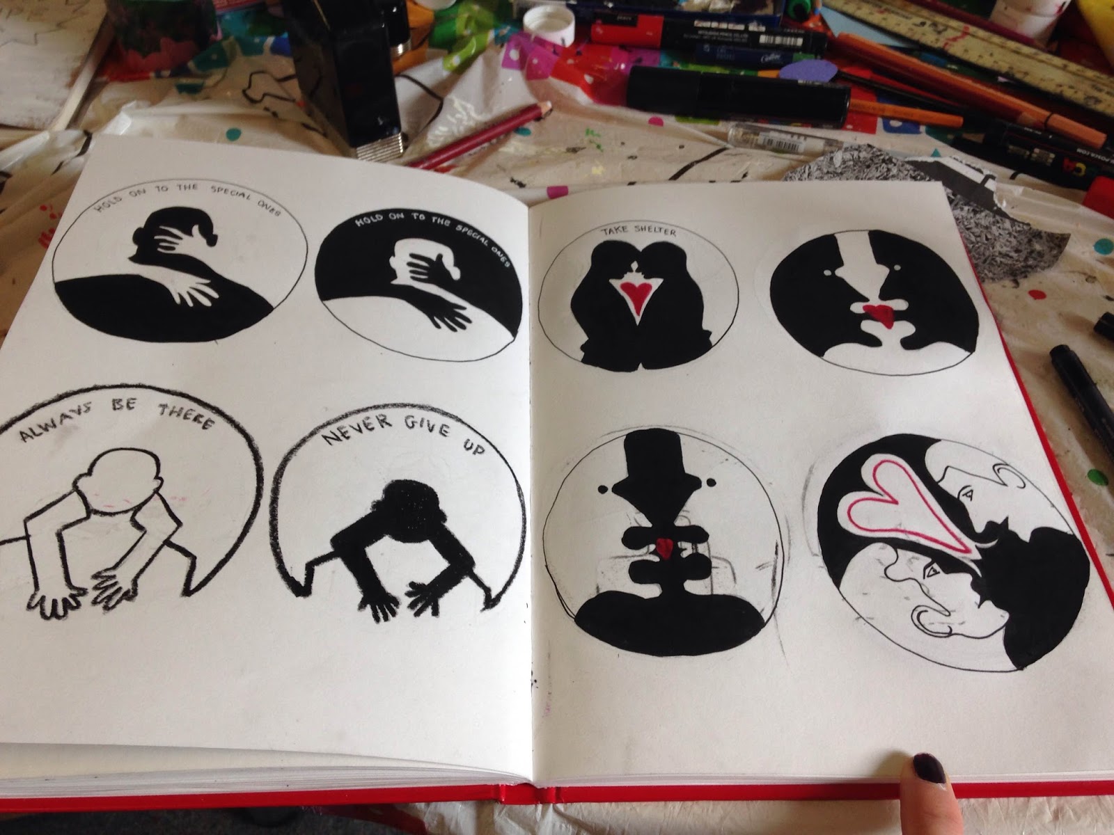
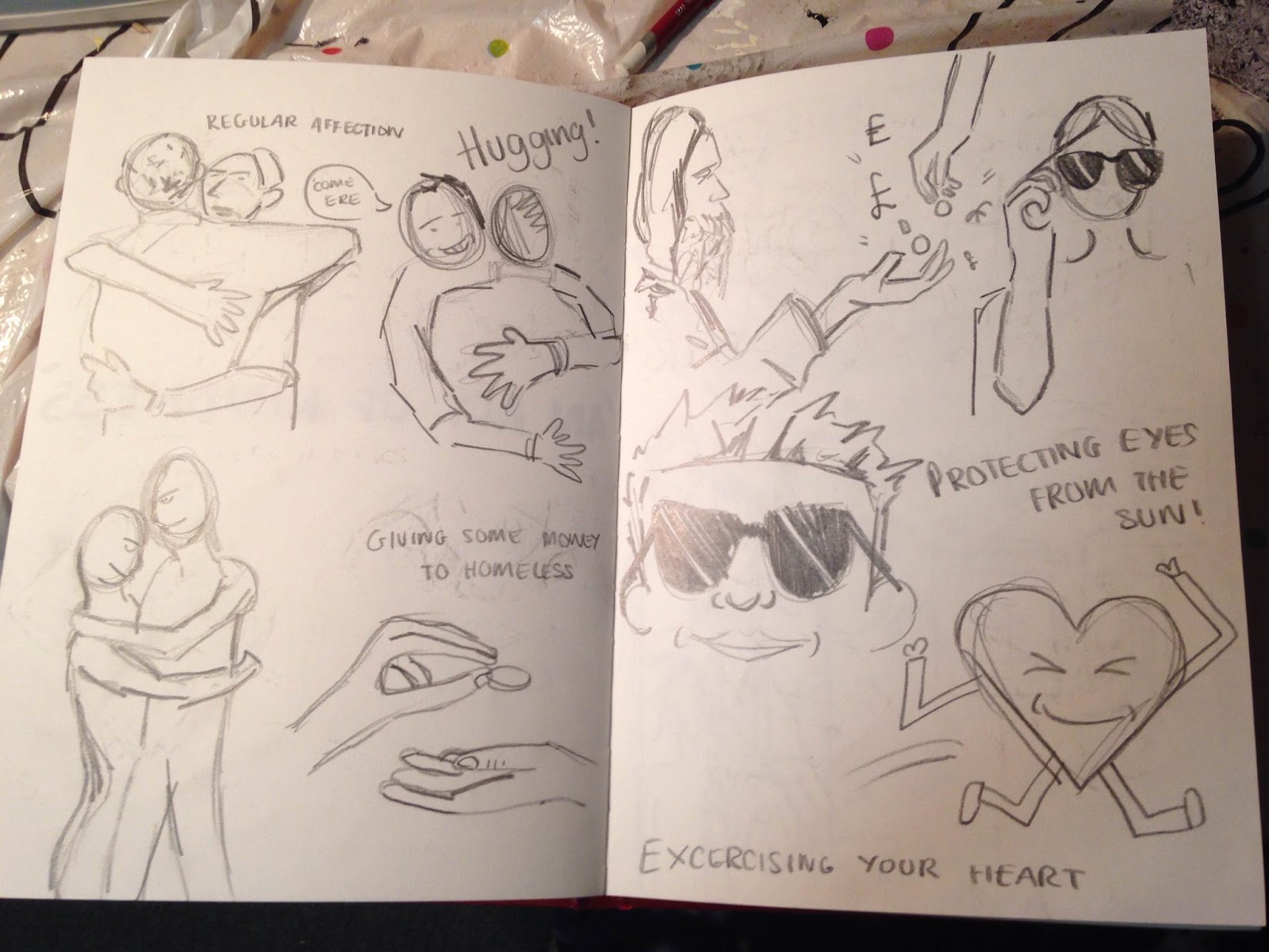
I will start my doing some rough sketches of acts of kindness. Maybe personal? maybe locally? maybe globally? maybe literally? and chose a more successful one then develop it further.


Small Exercise

We did a small drawing exercise to get us thinking about shapes and vectors, the simplification of more complex images,


I started with a more complex realistic drawing of someone about to pop a balloon with tonal values and shading. I then gradually started to simplify the image into its most simple terms. The last drawing is actually the drawing I find most interesting. What i like about it is the fact I have only used two shapes, yet you can clearly see it is someone standing on a balloon.

Screen print preperation


I scanned my image into Photoshop and decided to add some text. i wanted this to blend into the design, creating more of a subtle composition.I decided not to add the nose because I didn't want to have too many fine line drawings, over complicating the design.
Black and Red Positives


Wednesday 22 February 2017

More development


I found an imager of her but edited it slightly, adding the action of her holding the toothbrush and brushing her teeth. I think this idea works really well, almost like a campaign against bad breath which is kind of what her song is getting across. The image is nicely structured and works well simplified with bits of added colour. I aim to simplify this further, blocking some white areas with black.


I wanted her hair to be one of the main focal points as it is so big and prominent. Because of this I filled it with black. I think the combination of red and black work really well together. I decided to add some text within the tooth paste but realised actually it over complicates the image and doesn't really go together at all. I wanted to try out different compositions with the likes of Noma bar an inspiration. Playing around with the idea of combining two images but effectively and cohesively within one image so they flow nicely together. 


So here are a few experiments playing around with the idea of simple shapes and simplified compositions. I tried to do a Noma Bar creation using some Leshurr symbolism. I don't think it works that well because again i cant seem to get the side profile very well. I think the most effective design are my previous simple front profiles, as they seem more striking. 

4

Idea sketching and development


Here are just some rough ideas and starting points. Because most of her songs are titled 'Queen Speech' I felt it was very necessary to include the word queen in my design. I also wanted to use the visuals of brushing your teeth as one of her more famous songs is about brushing your teeth. 
Anyway I decided to think outside the box with this one and came up with an interesting idea of morphing Leshurr into the queen on a playing card. instead of wearing a crown she is wearing her infamous snap back with her logo on it. I decided to add a speech bubble with some of her infamous, iconic lyrics. In terms of composition I felt like this could work quite well being a portrait screen print and all. Also only using black and red (the colours of the queen of diamonds) would work well as a screen print - also both colours symbolising power and significance you could suggest. 


Here is a larger version of my idea. I quite like the concept but feel visually it doesn't quite work. I found it particularly difficult to draw the side of her face as there weren't any pictures on the internet that i could reference. I don't think it's a very striking image and and I feel it's quite hard to work out what is going on - I don't think it is very representational of Lady Leshurr. I wanted to play it simple and striking, two words I aim to consider. I want to go back to drawing the face but perhaps simplifying it down into basic shapes and colours, stamping my own style on it. 

Colour, Value and Notan


We use value in composition to create a focal point - bring something closer or send something back. a complimentary colour is used in some pieces of illustration to make something stand out, becoming the main focal point. There are many different value plans including light on dark behind mid and dark on light etc. Illustrations with fewer value plans in my opinion become more successful and dramatic, therefore more striking.

Colour palette - the variations of colour present within an illustration.

For this 2 week brief, I will create a fan art screen print using only 2 colours. 

My first thoughts were to think of someone who hasn't really had any fan art and is at the moment under the radar, not known by many people. I also wanted someone who has a lot of imagery or symbolism, something i could work with quite well. 

I decided to go for rap artist Lady Leshurr. I saw her in Leeds at Belgrave and thought she was amazing. The way she communicated and connected with the audience was so special and she got everyone going crazy. I will start to do some rough sketches and see where it all takes me!

Tuesday 21 February 2017

Final 3 gifs


Analogue Gif
 Digital Gif
3D/Lens Gif


Analogue Gifs

This is the gif created using my analogue studies of my character. I decided to loop it and have no delay for my frames so the transition is smooth from one analogue method to the other. The speed definitely works well and creates a sense of multiple personality - each study representing and portraying a different type of emotion. I will see what it looks like when slower and perhaps experiment with colour to portray emotion?


For this one i have slowed each frame down by 0.2 seconds. The transitions are not very smooth and fluid, therefore creating more of an awkward motion. I think the faster it is the more interesting the gif becomes. I could now start to explore colours perhaps? Seeing the gif flash from colour to colour? Or play around with inverting the images.


Inverted gif. The black background adds to the atmospheric vibe but i'm not a fan of the black box surrounding it. It looks much more effective. i could perhaps combine both the inversion and the normal image together in an alternating gif?


This is the alternating gif (inverted and normal). I really like the chaotic in your face outcome, as the flash from black to white really draws you in. 

Sunday 19 February 2017

Analogue gif experimenting

For my analogue gif I had a few ideas in mind. There's always an option of creating a flip book which could be quite interesting, especially if i want to make it into a game like structure. My other idea id drawing the same character again and again. Each drawing will look somewhat different and i think it will be interesting to create a gif out of this. Another idea is starting of with a thick pen and gradually use thinner and thinner pens until you can barely see the line in the last frame. Another idea is drawing the character out but in various mediums and techniques. I think this would look very interesting as a gif with the transition from one material to another, especially with a loop and at a fast pace?


Here are some experiments using various materials and techniques. Because they are all relatively different, I think it will look really effective as a gif, but i feel the transition has to be very fast for it to be successful. I want to stick to black and white with this because my two other gifs are predominantly focused on bright contrasting colours. I also like how with this one the movement is the transition from one analogue experiment to another which is completely different to my other gifs.

Stop motion animation extension


I created the fish using some expressive brush strokes using blue and yellow acrylic paint. I then cut out the paper in shapes of fish and placed them around my character. I moved the fish ever so slightly from left to right so each frame the fish would be in a different position and create a sense of movement. My difficulty with this was keeping the character in the exact same position in each photograph, as it is pretty much impossible without a tripod. 


I think this idea is quite successful. Not moving the character itself but the background to create some kind of context. It is a shame that the character is not symmetrical and appears slightly wonky. I quite like the contrast between the pure simple block colours and the more expressive combinations of colours present in the fish. For my analogue gif I could potentially extend this idea further and create a game like gif? Like super mario brothers or doodle jump?

Stop motion animation


I created this by moving the eyes ever so slightly for each frame, to give off a pin ball effect, with the arms lifting the eyes above creating a loop. I think the symmetrical motion works really well. Maybe if I were to extend it further I could enhance the colour palette, making the colours less muddy and brighten them up a bit. I also didn't really clean up the edges so i could've made the edges smoother. Then again I quite like the rough texture and clear analogue style, I wouldn't want to bombard it with all these digital techniques to then turn into a digital gif and lose that hand made craft style.


This is my second stop motion animation. I used a different ground and different movement. Perhaps with this one I could've moved the arms and legs as well so there is a clear sense of continuity. I didn't however want to over complicate it and drift away from the main focal point. I think the purple background works really well though, adding a good amount of contrast. I thought I could extend this gif further by adding some kind of background instead of just coloured grounds. The blue background made me think of water so I was thinking the character could be surrounded by fishes swimming. I could make some fish out of paper.

3D crafting


I decided to make my character out of modelling clay to create yet another outcome and experiment with another material to convey my character in another light and bring it to life.


I initially decided to cut out the outline of my character from the clay because i thought it would be the easiest way. This didn't work very well because i realised i need to make quite a strong base in order for the character to stand up successfully. So i decided to start with the feet first, making sure they were secure and sturdy before creating the other features separately and then using water to mould them together. I then painted the clay and left it to dry so it would harden a bit.
I didn't want it to harden too much because I wanted to create a stop motion animation where i move the arms and legs.


So here is my model, reasonably hard so it wont fall apart, but also soft enough so I can move the features around. I founds it quite difficult to create this model as I don't tend to use clay often, so it was quite a new experience for me. I found it difficult to create symmetrical structure and balance within the character. It took me a while to combine all the features together using the water as the clay was still very soft so occasionally it would collapse. To get past this problem I kept adding clay to the base, making it as strong as possible  so it wouldn't fall. All in all i did enjoy making the model and feel it has turned out exactly as i wanted. From this I aim to create a few stop motion animations, maybe experimenting with different grounds and movements.


My character standing up.

Saturday 18 February 2017

Photography Gif experiments


This is the gif. I spent quite a bit of time editing the photographs and making the orange more of a pure colour. I considered getting rid of the seven but feel it gives it more of an edge. Bending my legs at the end is so successful, as it corresponds really well with the hat movement (putting on the hat and pushing down) like im pushing my whole body down. I like how smooth the transition is but do feel however it could be even more effective, if there is some kind of loop to loop it back round to the beginning. I will do this with my next experiment. 


This is the gif with that loop. I think it is really effective and creates more of a structured, free flowing movement which links so well with what I got from my initial song. It's quite fun and playful and I can imagine some old classical music perhaps with silent movie vibes.
Because I did the same shoot but with a white background. I was thinking I could perhaps combine to two shoots and create an alternate gif so it looks like it's flashing from on colour to another.


This is very complex and quite chaotic but feel like it kind of works. I think the speed adds so well to ewhat I was creating as you can only really see glimpses of what is happening. Its almost a complete contrast to my previous one in terms of movement - this is more jagged and a bit sporadic. I do feel though my previous one is more successful in terms of structure and simplicity and works more succesfully as a final with clear focal point. If I wanted to extend this idea further I could've perhaps looked at more colours flashing, adding to that party/rave vibe.   

Sequential gif movements


So for my gif movement I decided to go for a flip of the hat. I wanted to have something fairly simple, with restricted body movement to not over complicate my gif, as I gathered with my last gif that simplicity is most effective. I started off by taking photos of each movement instead of doing the movement in full and taking a series of sequential photographs. I think the orange actually works really well and corresponds with the hat, boots and glasses. Also the number 7 adds to the 'game' idea, perhaps indicating 'level 7' on the game? This was unintentional. I will now upload these photos to Photoshop and see what they look like as a gif.