Tuesday 28 March 2017

Evaluation


This module without a doubt has been my favourite. The projects have really allowed me to step out of my comfort zone and produce outcomes I never thought I was capable of. Each project I have tried to take risks and think outside the box when it comes to generating ideas and concepts.

I learnt so much throughout, like creating gifs, using 
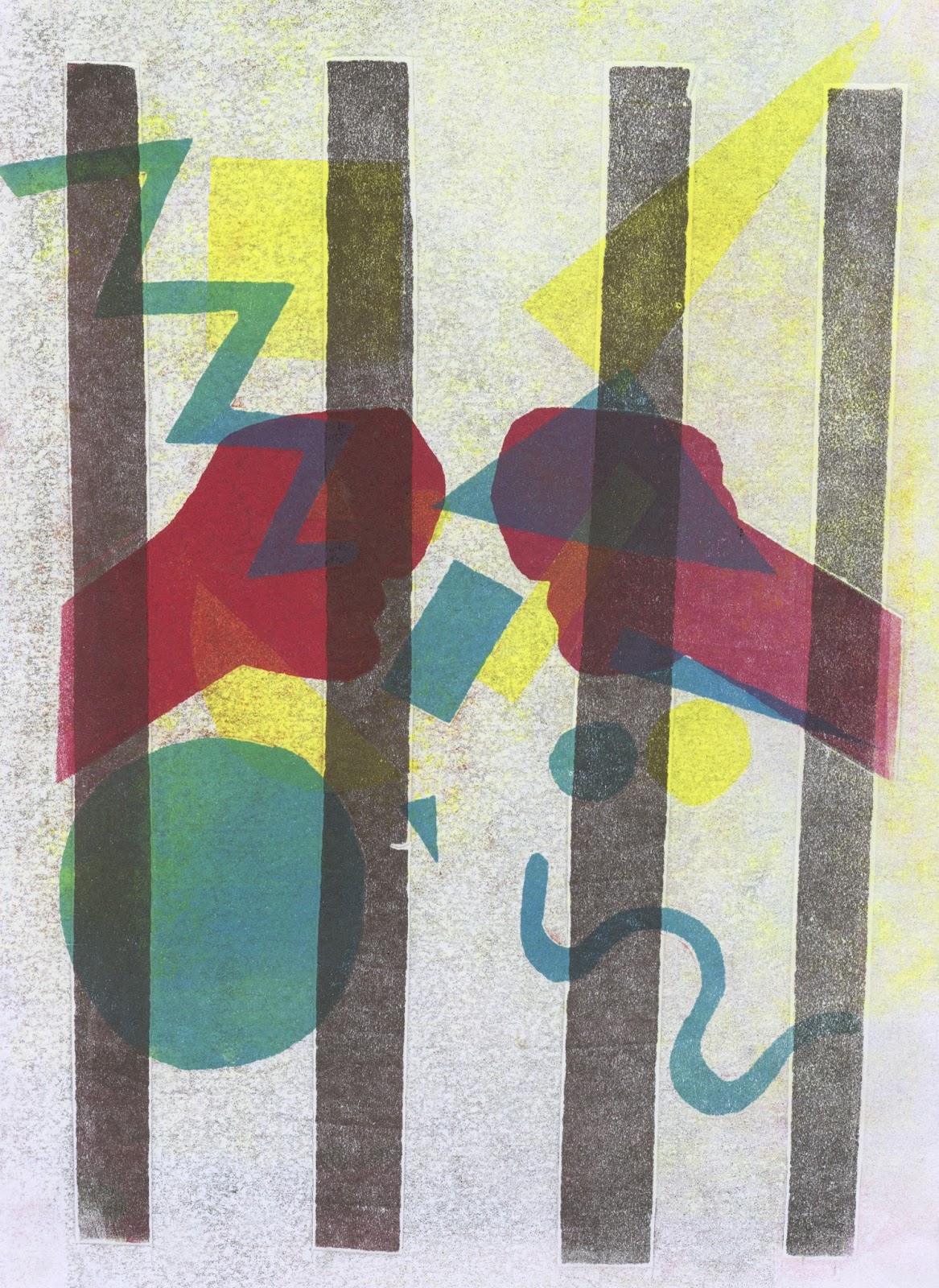
vectors on illustrator and even creating a lino print. Mono printing was an induction I was particularly drawn to – it allowed me to be really experimental with shapes and layering creating real abstract compositions. What I have really learnt throughout is to move away from the literal response to briefs – I have acknowledged that the most successful pieces of art are the ones in which at first, are a struggle to understand, but at a closer examination things start to become more recognizable.

My gifs were probably my strongest outcome because I invested so much time in creating and perfecting them. I think it was a great idea to try something new with my 3D idea by actually dressing up as my character. I enjoyed creating a completely new perspective. I thought my stickers reflected something deeper than just ‘an act of kindness’ – I felt like my concept was so relevant and actually quite a serious concept which everyone can relate to and be inspired by. With my Maya Angelou project, I really enjoyed the progression of my ideas from start to finish. I like how my initial idea changed so much throughout my ‘journey’ through tutorials, group crits and constant reflection on my work. I completely moved away from the literal sense and started to include some metaphorical ways of working. After my mono print session, I felt so motivated and inspired to create further prints because they turned out so successful. I decided to really experiment with this project, using all the skills I have learnt in the previous modules from illustrator to lino print to collage experiments. The introduction to gif making made me incredibly inspired as I didn’t know how easy it was to create. I may have got a bit carried away with this project in producing gif after gif, but I just felt so energized and had so many ideas.

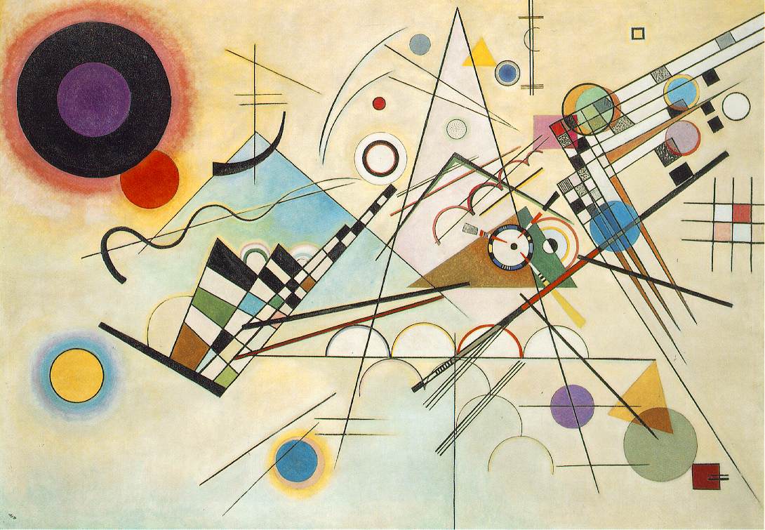
I used a range of artists to help with my inspiration. I used the internet but also some books from the library and an illustrator book I have at home which I occasionally look through. Analyzing shape driven artists really helped me in terms of composition and selecting colour palette. I have learnt so much about composition and the selection of colours through contextual research.

For future modules I aim to be much more conceptual with my ideas – be more metaphorical in my approaches and less literal. I aim to use more workshops, to widen my visual vocabulary and again try things I wouldn’t normally. Perhaps for future projects I could spend more time in the early stages producing roughs and playing around with more ideas, not just developing one design.

Final poster


I found this analogue experiment extremely fun allowing me to use all media to be really expressive. The combinations of pen and paint with collage and newspaper work so well together and conveys the idea of freedom quite well. It also represents music in a way I never would have imagined before. The cage looks as if it is broken which is exactly my intentions and was a struggle for me to portray in parts of my project. I definitely think analogue is the most effective way of portraying my idea as it creates more of a personal response - my literal response to her poem using my own personal hands and brush strokes to get my feelings across. It also creates a real sense of depth - something which is particularly hard to create on Photoshop. It was initially without the white collaged hands but adding them has allowed the composition to become more refined and brings closer attention to the concept - they seemed to be lost within all the shapes and chaos before. 

Group Crit


My final group crit was very useful in terms of making final changes before i went ahead on choosing my final outcomes. People felt that my simplified cage stamps were perhaps too simple and wasn't as successful as my analogue designs. people suggested that i focussed more on the analogue side of things as my collage experiments were so strong. This made me really think about my final poster as I want it to be the strongest image and if analogue seems to be the strongest maybe i should consider producing an analogue poster? This could be quite interesting with combinations of materials and shapes mashed together coming out of the cage creating an explosion of freedom? I will definitely try this on A2 paper as I think it would look really effective blown up - something I haven't actually tried yet for this project.

More stamp ideas


I feel like my previous stamp designs were just replicas of the previous designs and i don't know if I want every single format to be a cage. These are zoomed in aspects of both my post cards and poster. I think the abstract nature of them work so well and there is still that strong link between them and the other formats. I like how there is aspects of both collage and mono print along with digital techniques. They seem represent feeling and emotion when reading the poem - feelings which I get and probably things which Maya is going through when writing the poem. I like how it moves away from the whole cage concept and there is a real sense of intimacy present. 

Sunday 26 March 2017

Post card ideas


These are my three ideas for the postcards. I like how each design is completely different but they all work well together with the cage used as a motif. I also feel like each design conveys the idea of power and strength which is something I aimed on portraying - Maya being such a powerful and strong woman. 

Stamp designs

So for my stamp idea, I was thinking of taking small aspects from my collage experiments. This didn't particularly work as well as I hoped because the images didn't seem that interesting and perhaps I felt like it was a bit of a cop out - especially if I'm using them for my postcards. So i decided to again to create a whole new perspective of the cage - this time a very simplified version - minimalist style illustration. I think as a series this could work out really nicely with the post card, stamps and postcard each having a design with the same idea being reflected but done in various different ways and using different materials and techniques. Perhaps I could add some text in the hands so it blends nicely into the design - the words 'freedom' maybe. Maybe i could have a series of the same image not only using different colours but maybe different materials/processes.


Sebastien Thibault 

An artist I have only recently discovered in a book I was flicking through is a political based illustrator who pays huge attention to objects, shapes and colours to create conceptual illustrations. Much like Noma Bar's works of art, he uses very simple combinations of images to convey an interesting, striking concept. In a lot of his work he uses a real limited colour palette to create a stylish composition. For my stamps I aim to use a similar method of working - simplified image but perhaps using words as a way of composing my image. I aim to stick to a maximum of 3 colours.
  

Saturday 25 March 2017

Poster designs


I wanted to look at another perspective of the cage, a zoomed in version, going back to my collage. I scanned it into Photoshop and played around with filters and starting to add some shapes. The combinations of music notes and shape works really well and add to that idea of 'breaking free' through the power of voice. I am undecided at the moment whether to use a lot of combinations of colours or just stick to one colour. The variations of colour work well as they show they reflect the different tones of voice but does it become a bit too complex and do the shapes become mixed up and lost within the composition? I really like the contrast between the striking opaque music notes and the translucent coloured shapes - giving the composition alternative variations of tone. 

Further experimenting


I scanned my favourite mono print into Photoshop and played around with manipulating it. The layered images look really effective and convey the idea of movement quite well - the movement of the cage portraying the idea of determination of breaking free from the cage. I think maybe where I have used a lot of layering, the image starts to become a bit too complex and hard to read. I started to add the hands but I did so in more of a subtle way by altering the opacity so it doesn't become the main focal point. What I quite like about this idea is the fact that Maya is hidden behind the music - her voice is the main focal point and her hands are just a shadow. I feel like the shapes themselves portray a real sense of movement because of the direction in which they are going. I need to start thinking about compositional ideas and what I plan on using fro my final outcomes. 

Lino printing


I decided to do a lino print for the first time ever. I found it incredibly difficult to make and it ended up taking much longer than expected, It took me a while to grasp the technique so the final outcome looks a bit rough scratchy. I do quite like the rough texture and think it works quite well with the whole meaning. I'm not quite sure the shapes would fit into it though.

Further prints


For these mono prints, I decided to use simple geometric shapes as a replacement for music notes. This idea creates much more of an interesting composition. In terms of the conceptual side, I like how it is purely open for interpretation - the shapes can represent anything you want. This corresponds well with the poem, the subjective connotations. After all I have created my own personal response to a poem which isn't necessarily fact, it's just my reflection of her. I feel like the grainy effect and variations in opacities add so well to the overall concept, conveying that idea of struggle and the dirtiness of the tough road to freedom. My simplification of the hands works well as again it is not completely obvious what is happening which adds to the general amusing factor. What I really like about these prints is the overlay of shapes creating further colours. I thought a black cage on top of the shapes in the background would be quite successful but turns out because the black is so strong it overshadows everything. It also moves away from the whole subtle simplicity concept as it is clearly a cage that has been placed on top. The more successful ones are when the cage is kind of mix up within the overlay of shapes and textures, creating more of a chaotic composition. What would happen if I started to scan these in and perhaps made the composition even more chaotic and interesting? I need to start thinking about my final outcomes. Do I want to have a series of postcards perhaps using different materials but conveying the same idea? A mixed media zoomed in version for the poster? Aspects from these as my stamps?


Laura Berman


Laura Berman's use of overlapped shapes to create further colours relates well to much of my work with mono printing. She also uses mono prints to reflect her relocation and travel. She uses really simple shapes but combines them to create more complex compositions - it reflects a real sense of nature with her use of repetition also reflecting the idea of cells. 

Wednesday 22 March 2017

Collage


I used bits of thick cardboard to create the 'broken' cage. The texture of the cardboard allowed me to create interesting ripped effects. I like how it has now moved away from the 'literal' cage idea and I could simplify this further by simply zooming in and having just bars. 

I started to use shapes to represent music. This has now become very abstract and immediately become more 'open to interpretation'. I don't particularly like the relationship between the cage and the shapes - I feel like the cage is a bit too neat and refined, not conveying the idea of  aggression and strength and power. I also don't like how the shapes aren't coming out of the cage. 


With this idea I have combined a variety of materials from collage to oil pastel. I think as a composition it works really well and reflects that idea of being trapped but again the colours represent a sense of hope and of course freedom - breaking free from the cage. The ripped effect of the blue cage works quite well too. The outline of the cage is mixed up in the chaotic surroundings of shape and colour, moving away from its literal state. Maybe the colours are a bit too bright?
I could scan it in and perhaps add some extra alterations - reduce the saturation add some more black and greys. I definitely think the shapes represent music quite well so maybe i could go back to my mono prints and use shapes instead of music notes?


I painted and drew on top of a printed out photocopy. I've started to really enjoy not only using shape but materials with an interesting texture as a way of representing music and think it looks really effective.Perhaps with this one it isn't quite as successful because there is no correspondence with the cage - it looks a bit obscure and there is no real depth. I prefer the idea of having shapes both underneath and on top of the cage because that way it actually looks like 'music' is coming out of the cage.

Image result for kandinsky

Kandinsky - an artist who relates to a lot of the work I've been doing in terms of using shape as a form of communication. His use of over lapping shapes to create further colours and his use of different media to create alternative textures also relates to what I am doing. The lines in Kandinsky's piece of art represent that sense of anger and power - but the bright contrasting colours also project a sense of hope and happiness? I feel like aspects of this is evident in much of my recent work and what I am trying to communicate.


Photoshop manipulations


I scanned my prints into Photoshop and played around with layering and altering opacity. I think this was incredibly successful. The double exposure effect allows the image to convey a real sense of movement - as though the cage is rattling and becoming more and more broken. This is also intensified by the hands looking as though they are moving. There is a real sense of strength and power being portrayed and determination to get freedom from the cage. Perhaps the yellow is a little too bright for the message being conveyed but as an image I think it works very successfully. I could perhaps print these out and start to cut them up and draw on top of them? create some mixed media pieces of art. I will also start experimenting with ways of representing music.

Group Review


Good points:

My mono prints seem to be a big talking point. People loved the colours and 'dirtiness' of the backgrounds. This is the media people thought was most exciting. A couple of people thought that I could perhaps combine both the collage and mono prints and perhaps draw on top? This could be quite interesting.

Future plans:

Continue breaking down the imagery and using visual devices like the cage. 
Consider some more images - keep designing - People thought I had good media experimentation.
Go away from one design. Explore and isolate aspects?
Explore different compositions?  

Peer Review

  For my poster they thought I could have the zoomed in version of the cage as a mono print. For my postcards they suggested I could have three of the same cage image but using different colours or processes perhaps? For my 4 stamps they suggested I could have zoomed in aspects. 

Tutor feedback

My tutor mentioned that i should think about how to represent music (rather than the obvious). Moving away from the literal representation. 

What is successful?

Simplified imagery - moved away from literal - made a sad concept more positive.


What is great?

My experimentation with media and my personal response to the poem. 


What is exceptional?

Materials - works with colour - not too in your face - manages to capture the essence of her spirit in the work. 


Reflection:


After all this feedback I think I will start to look at mixing media like collage and mono prints and perhaps scanning them into Photoshop and seeing what kind of experiments I can do. I also want to experiment with low relief collage so the cage looks as though it is coming out of the page, creating more of a striking image. I will also look at different ways of representing the music coming out of the cage whether it be shape or scribbles. Do I want to add some text in the image and if so how will it work and correspond with the image?

Monday 20 March 2017

Evaluation


This module has taught me a lot about creating imagery through different medias. It has allowed me to engage in various ways of creating imagery from shape and texture to line quality.
The shape and texture task was probably most useful to me as it really allowed for experimentation with the simplification of more complex images using simple cut outs of paper. This is a concept that has really inspired me and I have tried to use it in my other modules where possible. I enjoyed using different variations of mark making using both large brushes and smaller ones to create line work. I feel like the combination of thick and thin lines creates an interesting piece of work. I have learnt the various ways of creating depth through tone, line and colour.

I found the session in which I had to memorise a photograph for 2 minutes and the draw it from my memory was very useful and I feel like it made me a better image maker. It was interesting to see the development of the drawing and how it became more refined. I also really liked the fruit task where we had to use simple shapes to represent a fruit. It allowed me to be very abstract and really focus on the fruit, taking important aspects from it. With the texture and shape task, I decided to really experiment with texture and put all my focus on using a range of media and materials which turned into quite a mess. This was because I completely forgot about shape and structure of the image which let me down in the end. I went away and learnt from this to create a portrait of myself with a sole focus on shape and colour – this was a much more successful piece.

The screen print task I found particularly difficult. I couldn’t seem to think of something which would work as a screen print and have interesting imagery. I also don’t think I invested as much time and effort in thinking about composition etc and feel if I were to do it again I would consider background and fitting everything into a frame.

I looked at artists from the power point presentations and that gave me some inspiration and help in the process of making images. It was interesting looking at other shape driven artists to help me make sense of simple but effective imagery.

One of the main things I have improved on throughout this module is my observational skills and the sense of freedom I have now when drawing something from life. I used to be so closed and concerned about not producing a perfectly illustrated drawing. This module has allowed me to come to the realization that it is ok to produce bad drawings at the beginning and more often than not the ‘bad’ drawings turn out to be the most interesting.