

I used bits of thick cardboard to create the 'broken' cage. The texture of the cardboard allowed me to create interesting ripped effects. I like how it has now moved away from the 'literal' cage idea and I could simplify this further by simply zooming in and having just bars.
I started to use shapes to represent music. This has now become very abstract and immediately become more 'open to interpretation'. I don't particularly like the relationship between the cage and the shapes - I feel like the cage is a bit too neat and refined, not conveying the idea of aggression and strength and power. I also don't like how the shapes aren't coming out of the cage.


With this idea I have combined a variety of materials from collage to oil pastel. I think as a composition it works really well and reflects that idea of being trapped but again the colours represent a sense of hope and of course freedom - breaking free from the cage. The ripped effect of the blue cage works quite well too. The outline of the cage is mixed up in the chaotic surroundings of shape and colour, moving away from its literal state. Maybe the colours are a bit too bright?
I could scan it in and perhaps add some extra alterations - reduce the saturation add some more black and greys. I definitely think the shapes represent music quite well so maybe i could go back to my mono prints and use shapes instead of music notes?

I painted and drew on top of a printed out photocopy. I've started to really enjoy not only using shape but materials with an interesting texture as a way of representing music and think it looks really effective.Perhaps with this one it isn't quite as successful because there is no correspondence with the cage - it looks a bit obscure and there is no real depth. I prefer the idea of having shapes both underneath and on top of the cage because that way it actually looks like 'music' is coming out of the cage.
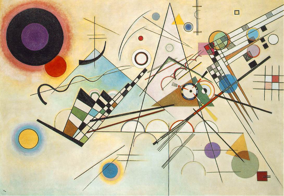
Kandinsky - an artist who relates to a lot of the work I've been doing in terms of using shape as a form of communication. His use of over lapping shapes to create further colours and his use of different media to create alternative textures also relates to what I am doing. The lines in Kandinsky's piece of art represent that sense of anger and power - but the bright contrasting colours also project a sense of hope and happiness? I feel like aspects of this is evident in much of my recent work and what I am trying to communicate.
No comments:
Post a Comment